Kerenene
Te Whakapapa o Te Waitohu Kerenene
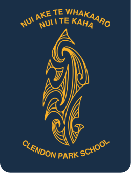
The concepts behind our school logo design
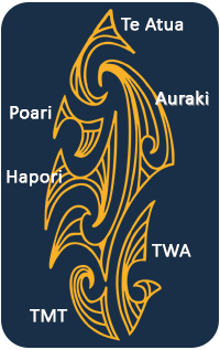
Our school logo was especially designed to represent the elements of our school classes and structure. Te Kerenene Pāka logo - waitohu - takes on the characteristic of a human body. It is constituted of six substantive entities. These are Auraki, Te Whānau Āwhina, Tautua mo Tupulaga, Hapori, Poari Kaitiaki and Te Atua.
Wahanga Tuatahi
Auraki – Te Tinana
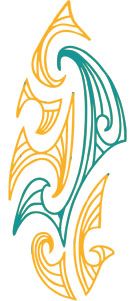
Auraki is the Māori name for Mainstream. The tinana (body) stretches from the kaki (base) of the upoko (head) down the length of the waitohu (logo) to just above the waewae (foot). This represents all the students, teaching staff, and support staff at Clendon Park School. The patterns are based on the koru, which is said to represent new beginnings, growth and re-generation.
“Ka hinga atu he tete-kura – ka hara-mai he tete-kura”
“As one fern frond dies – another one is born to take its place”.

Wahanga Tuarua
Te Ringaringa Maui
Te Whānau Āwhina
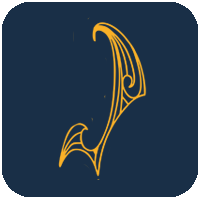
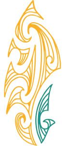
The second entity is Te Whānau Āwhina. Positioned on the taha ringa maui of the waitohu it represents Te Ao Māori and the role it has at Clendon Park School. The positioning acknowledges the Marautanga (curriculum) and motuhake (special character). The pattern is inspired by the toki, it is said that it represents strength, courage, and perseverance; all virtues that are entrenched in the learning and teachings of Te Whānau Āwhina.

Wahanga Tuatoru
Te Waewae Matau
Tautua mo tupulaga
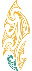
The third entity is Tautua mo Tupulanga. Positioned in the fourth quartile of the waitohu it is the waewae matau (right foot). The pattern is inspired by the ika matau, it is said that it represents prosperity and safe travel over water. Tautua mo Tupulaga provides our Samoan students with the opportunity to maintain their culture and extend their language within a Samoan bilingual setting.

Wahanga Tuawha
Te Ringaringa Matau
Te hapori
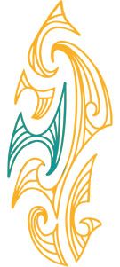
The fourth entity is Hapori or tō mātau wāhi. Positioned on the taha ringa matau (right hand side) the pattern is inspired by the manaia as it is said that it represents guardianship or kaitiakitanga. That is appropriate as we have an amazing school community, whānau and families.

Wahanga Tuarima
Te Poari Kaitiaki
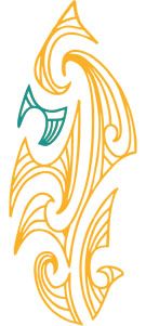
The fifth entity is Te Poari Kaitiaki aka pokohiwa. This is found in the third quartile adjacent to the upoko (head). The design is influenced by the roimata pattern as it is said that it encourages knowledge, confidence, independence and pride. All elements that have been fostered and encouraged by our board and senior management team as priority expectations.

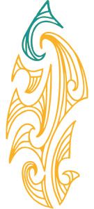
Wahanga Tuaono
Te Upoko Te Atua
The sixth is acknowledgement of Te Atua. Located at the upoko (head) of the waitohu. Te tohu o te atua is casting an attentive and watchful (kaitiaki) eye over Kerenene, allowing Kerenene to develop, grow and thrive as an inclusive and progressive learning institution.
Underpinning the waitohu (logo) is quality education and learning. Mauri ora.
